Создание представления сложного списка
В этом примере показано, как создать комплекс ListView.
Примерный обзор
В примере создается окно редактора со списком символов. Каждый символ имеет ползунок и цветовую палитру. Перемещение ползуна изменяет цвет палитры.
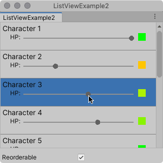
Вы можете найти завершенные файлы, созданные этим примером, в хранилище GitHub.
Предварительные условия
Это руководство предназначено для разработчиков, знакомых со скриптами Unity Editor, UI Toolkit и C#. Перед началом работы ознакомьтесь со следующим:
Создание примера
Этот пример создает визуальные элементы в списке из скрипта C#. В нем используется пользовательский CharacterInfoVisualElement класс, который наследуется от VisualElement, и привязывает пользовательские элементы к CharacterInfo объектов.
- Создайте проект Unity с любым шаблоном.
- В окне Project создайте папку
Editor. - В папке
Editorсоздайте файл скрипта C# с именемListViewExample.csсо следующим содержимым:
using System;
using System.Collections.Generic;
using UnityEditor;
using UnityEngine;
using UnityEngine.UIElements;

namespace UIToolkitExamples {
    public class ListViewExample: EditorWindow {
        // Gradient used for the HP color indicator.
        private Gradient hpGradient;
        private GradientColorKey[] hpColorKey;
        private GradientAlphaKey[] hpAlphaKey;

        // ListView is kept for easy reference.
        private ListView listView;

        // List of CharacterInfo items, bound to the ListView.
        private List < CharacterInfo > items;
        [MenuItem("Window/ListView Custom Item")]
        public static void OpenWindow() {
            GetWindow < ListViewExample > ().Show();
        }

        private void OnEnable() {
            SetGradient();

            // Create and populate the list of CharacterInfo objects.
            const int itemCount = 50;
            items = new List < CharacterInfo > (itemCount);
            for (int i = 1; i <= itemCount; i++) {
                CharacterInfo character = new CharacterInfo {
                    name = $"Character {i}", maxHp = 100
                };
                character.currentHp = character.maxHp;
                items.Add(character);
            }

            // The ListView calls this to add visible items to the scroller.
            Func < VisualElement > makeItem = () => {
                var characterInfoVisualElement = new CharacterInfoVisualElement();
                var slider = characterInfoVisualElement.Q < SliderInt > (name: "hp");
                slider.RegisterValueChangedCallback(evt => {
                    var hpColor = characterInfoVisualElement.Q < VisualElement > ("hpColor");
                    var i = (int) slider.userData;
                    var characterInfo = items[i];
                    characterInfo.currentHp = evt.newValue;
                    SetHp(slider, hpColor, characterInfo);
                });
                return characterInfoVisualElement;
            };

            // The ListView calls this if a new item becomes visible when the item first appears on the screen,
            // when a user scrolls, or when the dimensions of the scroller are changed.
            Action < VisualElement, int > bindItem = (e, i) => BindItem(e as CharacterInfoVisualElement, i);

            // Height used by the ListView to determine the total height of items in the list.
            int itemHeight = 55;

            // Use the constructor with initial values to create the ListView.
            listView = new ListView(items, itemHeight, makeItem, bindItem);
            listView.reorderable = false;
            listView.style.flexGrow = 1f; // Fills the window, at least until the toggle below.
            listView.showBorder = true;
            rootVisualElement.Add(listView);

            // Add a toggle to switch the reorderable property of the ListView.
            var reorderToggle = new Toggle("Reorderable");
            reorderToggle.style.marginTop = 10f;
            reorderToggle.value = false;
            reorderToggle.RegisterValueChangedCallback(evt => listView.reorderable = evt.newValue);
            rootVisualElement.Add(reorderToggle);
        }

        // Sets up the gradient.
        private void SetGradient() {
            hpGradient = new Gradient();

            // HP at 0%: Red. At 10%: Dark orange. At 40%: Yellow. At 100%: Green.
            hpColorKey = new GradientColorKey[4];
            hpColorKey[0] = new GradientColorKey(Color.red, 0f);
            hpColorKey[1] = new GradientColorKey(new Color(1f, 0.55f, 0f), 0.1f); // Dark orange
            hpColorKey[2] = new GradientColorKey(Color.yellow, 0.4f);
            hpColorKey[3] = new GradientColorKey(Color.green, 1f);

            // Alpha is always full.
            hpAlphaKey = new GradientAlphaKey[2];
            hpAlphaKey[0] = new GradientAlphaKey(1f, 0f);
            hpAlphaKey[1] = new GradientAlphaKey(1f, 1f);
            hpGradient.SetKeys(hpColorKey, hpAlphaKey);
        }

        // Bind the data (characterInfo) to the display (elem).
        private void BindItem(CharacterInfoVisualElement elem, int i) {
            var label = elem.Q < Label > (name: "nameLabel");
            var slider = elem.Q < SliderInt > (name: "hp");
            var hpColor = elem.Q < VisualElement > ("hpColor");
            slider.userData = i;
            CharacterInfo characterInfo = items[i];
            label.text = characterInfo.name;
            SetHp(slider, hpColor, characterInfo);
        }

        private void SetHp(SliderInt slider, VisualElement colorIndicator, CharacterInfo characterInfo) {
            slider.highValue = characterInfo.maxHp;
            slider.SetValueWithoutNotify(characterInfo.currentHp);
            float ratio = (float) characterInfo.currentHp / characterInfo.maxHp;
            colorIndicator.style.backgroundColor = hpGradient.Evaluate(ratio);
        }

        // This class inherits from VisualElement to display and modify data to and from a CharacterInfo.
        public class CharacterInfoVisualElement: VisualElement {
            // Use Constructor when the ListView uses makeItem and returns a VisualElement to be
            // bound to a CharacterInfo data class.
            public CharacterInfoVisualElement() {
                var root = new VisualElement();

                // The code below to style the ListView is for demo purpose. It's better to use a USS file
                // to style a visual element.
                root.style.paddingTop = 3f;
                root.style.paddingRight = 0f;
                root.style.paddingBottom = 15f;
                root.style.paddingLeft = 3f;
                root.style.borderBottomColor = Color.gray;
                root.style.borderBottomWidth = 1f;
                var nameLabel = new Label() {
                    name = "nameLabel"
                };
                nameLabel.style.fontSize = 14f;
                var hpContainer = new VisualElement();
                hpContainer.style.flexDirection = FlexDirection.Row;
                hpContainer.style.paddingLeft = 15f;
                hpContainer.style.paddingRight = 15f;
                hpContainer.Add(new Label("HP:"));
                var hpSlider = new SliderInt {
                    name = "hp", lowValue = 0, highValue = 100
                };
                hpSlider.style.flexGrow = 1f;
                hpContainer.Add(hpSlider);
                var hpColor = new VisualElement();
                hpColor.name = "hpColor";
                hpColor.style.height = 15f;
                hpColor.style.width = 15f;
                hpColor.style.marginRight = 5f;
                hpColor.style.marginBottom = 5f;
                hpColor.style.marginLeft = 5f;
                hpColor.style.backgroundColor = Color.black;
                hpContainer.Add(hpColor);
                root.Add(nameLabel);
                root.Add(hpContainer);
                Add(root);
            }
        }

        // Basic data class used for a character, with a name and HP data. Use a list of CharacterInfo as
        // a data source for the ListView. The CharacterInfo can be bound to CharacterInfoVisualElement when needed.
        [Serializable]
        public class CharacterInfo {
            public string name;
            public int maxHp;
            public int currentHp;
        }
    }
}
- Чтобы посмотреть пример, в меню выберите Окно > ListView Пользовательский элемент.