UI Toolkit
UI Toolkit
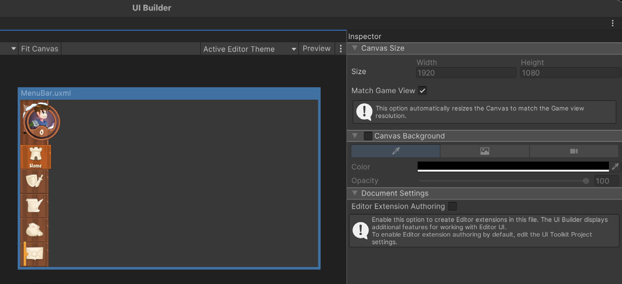
Создавайте интерфейс по визуальному референсу Фон Canvas помогает оценить оформление элементов поверх заданного цвета или фонового изображения. Выберите UXML-файл в панели Hierarchy, а затем задайте Canvas background, приближённый к итоговому интерфейсу, чтобы оценивать изменения стиля в контексте. Для Canvas background доступно несколько вариантов: - Background Color - определённый цвет или оттенок игрового окружения. - Image - спрайт или текстура в качестве фона; удобно для воспроизведения макетов экранов и референсных изображений. - Camera - текущий игровой процесс на фоне, позволяющий оценить UI непосредственно в контексте игры.
©2025UnityTechnologies
Canvas UXML-документа: настройка внешнего вида с помощью параметров Color и Image
Ускорьте итерации при работе с файлами Photoshop с помощью PSD Importer Если многослойный PSD-файл импортирован в проект с помощью PSD Importer, Unity автоматически обновляет содержащиеся в нём спрайты при каждом сохранении файла. Благодаря этому можно быстро создать черновой вариант, дорабатывать его и сразу видеть изменения в Game view. Такой подход заметно экономит время и повышает качество результата: вы оцениваете его в контексте, не заменяя файлы и не обращаясь за помощью к другому разработчику команды.
Используйте эмодзи в игре С помощью тегов Rich Text в текст можно добавлять спрайты, например эмодзи. Для этого потребуется ассет спрайтов, аналогичный ассету Gradient. При импорте нескольких спрайтов упакуйте их в один атлас, чтобы сократить количество вызовов отрисовки. Убедитесь, что разрешение атласа спрайтов подходит для целевой платформы.
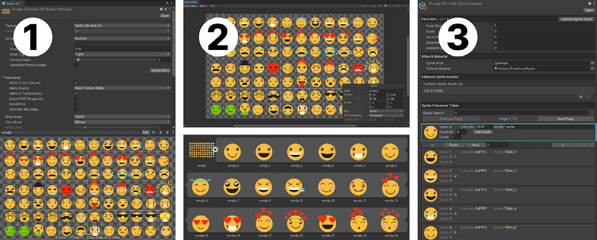
Импортируйте спрайты, создайте Sprite Asset в папке Assets/Resources и при необходимости настройте сведения о каждом глифе.
©2025UnityTechnologies
Используйте системные эмодзи устройства Если приложение предназначено для конкретной платформы выполнения, например iOS или Android, вместо добавления исходного шрифта в проект можно использовать встроенный системный шрифт эмодзи. Это экономит память и избавляет от необходимости включать в приложение большую коллекцию эмодзи.
Чтобы использовать в проекте эмодзи операционной системы, выполните следующие действия:
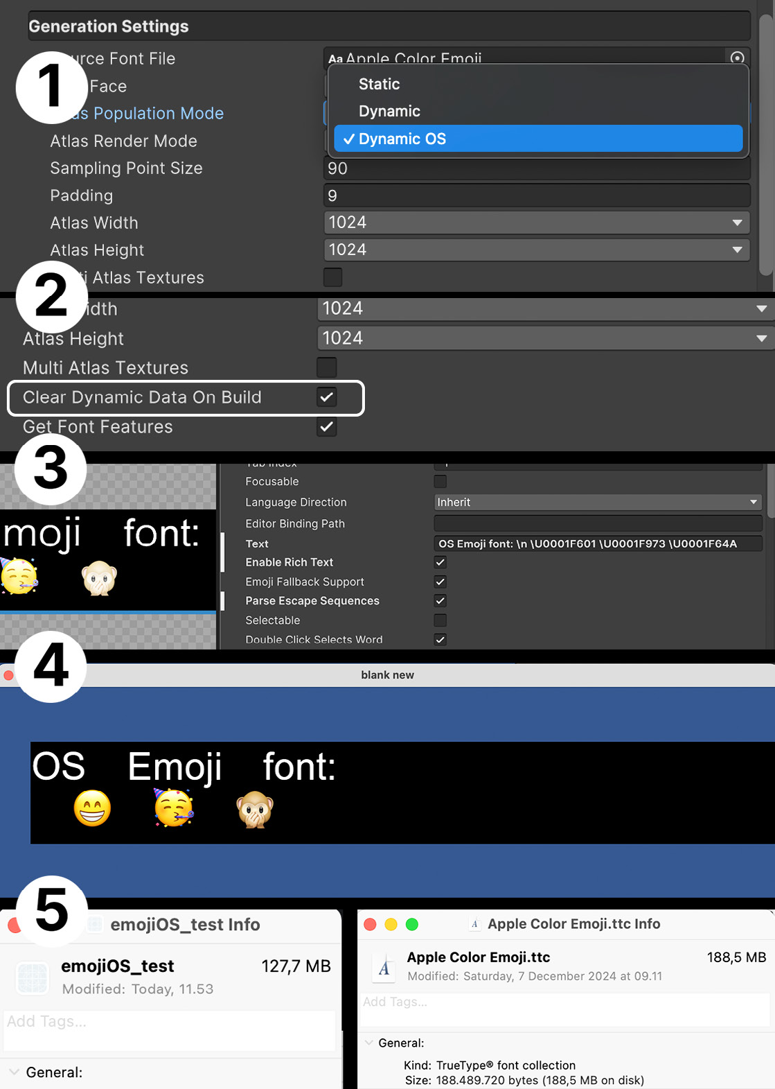
1. Создайте Font Asset на основе шрифта целевой системы. В iOS он называется Apple Emoji (этот шрифт используется в примере), а в Android - Noto Color Emoji; в настоящее время поддерживается только COLRv0. Убедитесь, что для Font Asset задан тип Color, затем установите для Atlas Population Mode значение Dynamic OS. В этом режиме не требуется включать исходный шрифт в ассет, что экономит место. 2. Убедитесь, что для Font Asset включён параметр Clean Dynamic Data On Build. 3. В UI Builder включите Parse Escape Sequences и введите нужные эмодзи с помощью клавиатуры эмодзи macOS или Windows либо в формате UTF. Например, смайлик можно задать как \U0001F601. UTF-код каждого эмодзи указан в Character Table объекта Font Asset. 4. Сборка, запущенная в macOS, отображает эмодзи с помощью шрифта операционной системы.
5. В нашем тесте размер сборки оказался меньше размера отдельного шрифта эмодзи. Это подтверждает, что шрифт не был включён в проект, хотя продолжал использоваться для отображения соответствующих эмодзи.
©2025UnityTechnologies
©2025UnityTechnologies
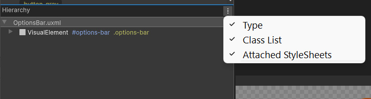
Отображайте дополнительную информацию о Visual Element в UI Builder Нажмите кнопку с вертикальным многоточием ( ) в заголовке Hierarchy, чтобы отобразить дополнительные сведения об элементах UI.
В панели Hierarchy рядом с типом элемента появятся дополнительные сведения. Если включить соответствующие параметры, будут показаны селектор имени #options-bar и селектор класса стиля .options-bar.
Фильтрация различных селекторов в панели Hierarchy
Можно заметить, что некоторые селекторы начинаются с префикса .unity-. Это стандартные стили, применяемые ко всем элементам. Любые явно заданные селекторы переопределяют эти значения.
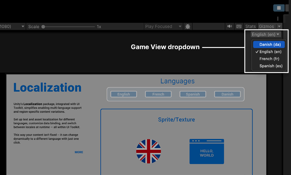
Охватывайте больше рынков, внедряя локализацию на раннем этапе Процесс локализации можно упростить, интегрировав пакет Localization с UI Toolkit. Такая интеграция позволяет предоставлять игрокам содержимое для их региона независимо от того, где они находятся. Используйте раскрывающийся список Game View Locale для предварительного просмотра UI на разных языках и проверки правильности отображения элементов в каждой локали.
Предварительный просмотр локализации с помощью раскрывающегося списка Game View Locale
©2025UnityTechnologies
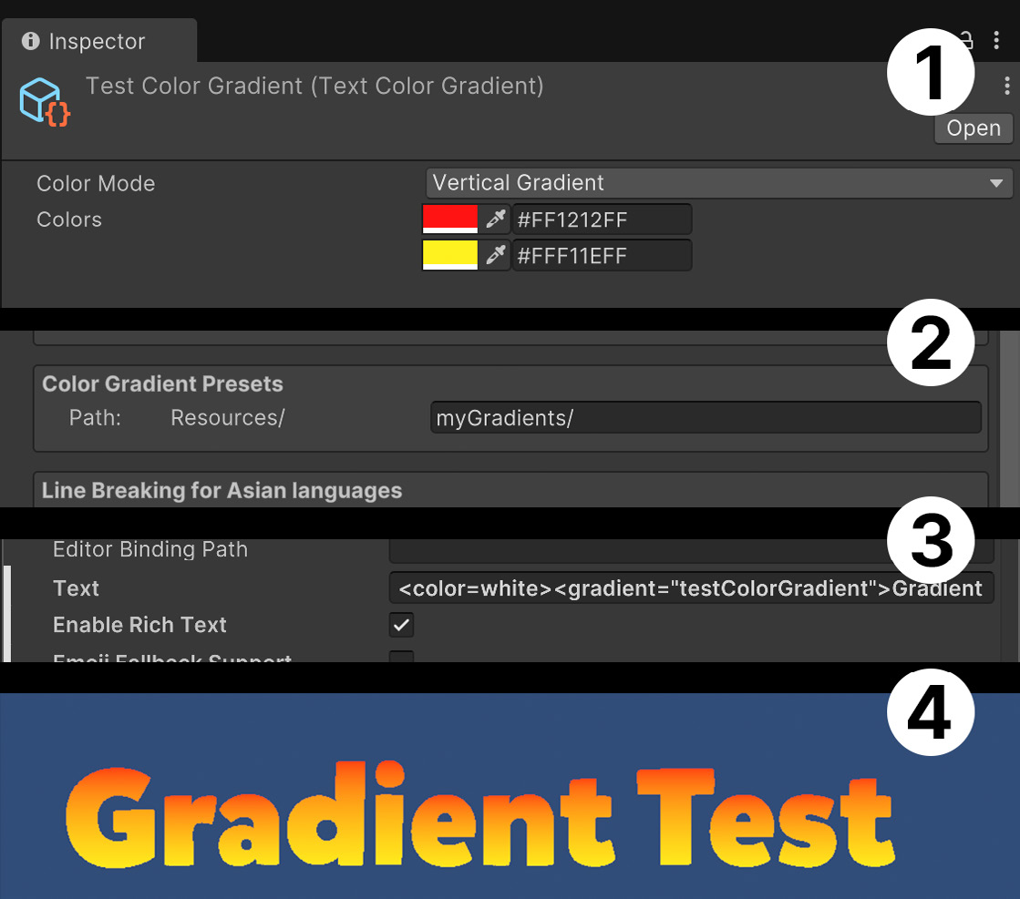
Стилизуйте весь интерфейс с помощью градиентов В UI Toolkit градиенты применяются с помощью тега <gradient>. Убедитесь, что параметр Rich Text включён: результат будет виден в UI Builder и в Game view. 1. Создайте ассет градиента через Create > Text Core > Gradient Color. Поместите файл в Assets/Resources или в любую вложенную папку Resources. 2. Создайте ассет Text Settings, на который будет ссылаться Panel Settings. Найдите в нём параметр Color Gradient Presets и укажите папку или вложенную папку Resources, где находится ассет градиента. 3. В UI Builder добавьте следующие теги Rich Text: <color=white><gradient="testColorGradient">Gradient Test</gradient></color>. Тег color возвращает белый цвет шрифта, чтобы градиент выглядел правильно. Имя в теге gradient должно совпадать с именем ассета, созданного на шаге 1. Убедитесь, что параметр Rich Text включён. 4. Результат изменений можно увидеть в UI Builder или в Game view.
Использование тега <gradient> в UI Toolkit
©2025UnityTechnologies
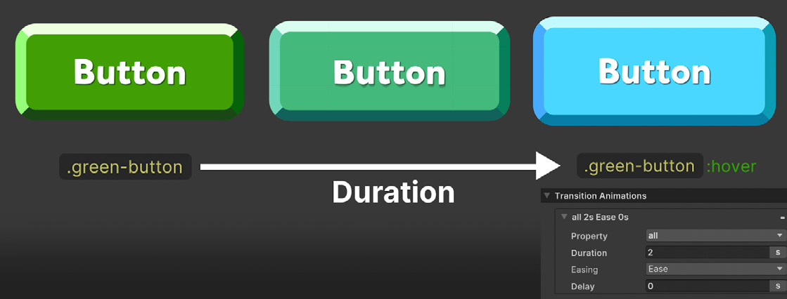
Анимируйте UI с помощью переходов USS Для визуальных элементов анимацию можно реализовать без дополнительного кода, поскольку у псевдоклассов (:active, :inactive, :hover и т. д.) могут быть собственные селекторы. Когда псевдокласс вызывает изменение стиля, заданные переходы автоматически анимируют это изменение. Например, кнопка может увеличиваться или уменьшаться при наведении (:hover) или нажатии (:active), а элементы - постепенно исчезать или становиться невидимыми в ответ на действия пользователя и другие события.
Такие смены состояния обычно вызываются действиями пользователя, однако псевдоклассы :enabled и :disabled можно менять программно. Это вручную запускает связанные с ними анимации USS и позволяет вызывать анимацию из кода в нужный момент.
Пример анимации перехода USS
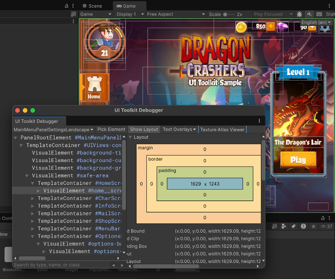
Показывайте рамки вычисленных стилей в редакторе Ограничивающие рамки помогают выявлять ошибки компоновки и выравнивания, а также интерактивно отлаживать структуру UI в редакторе. Чтобы отобразить вычисленные ограничивающие рамки средствами UI Toolkit, выберите Window > UI Toolkit > Debugger и откройте UI Toolkit Debugger. Затем инструментом Pick Element выберите нужный элемент UI и включите Show Layout. Поверх UI в Game view появятся ограничивающие рамки и сведения о компоновке.
©2025UnityTechnologies
UI Toolkit Debugger содержит несколько удобных средств отладки UI.
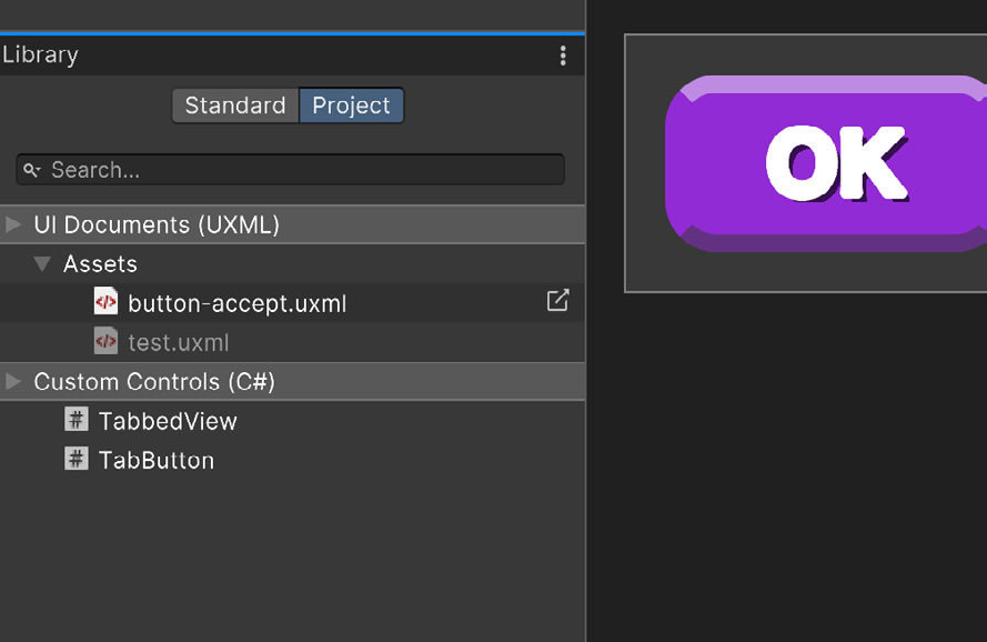
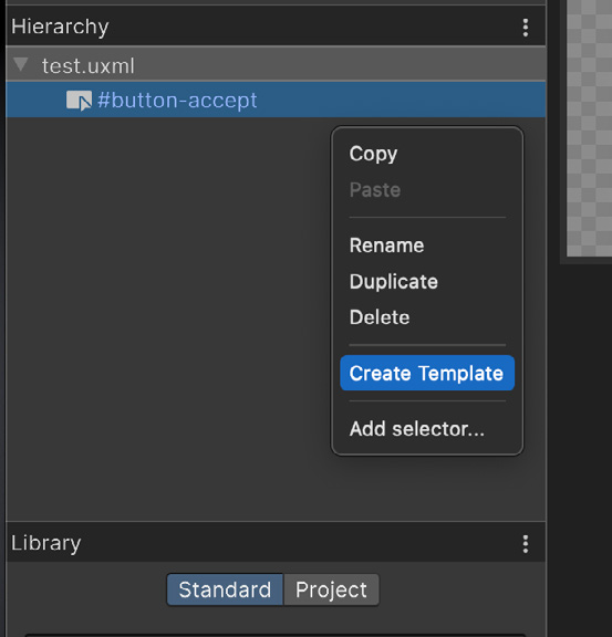
Повторно используйте файлы UXML как шаблоны, чтобы ускорить работу Файлы UXML можно использовать аналогично префабам. Например, в проекте может быть UXML-макет со значком предмета и счётчиком количества, который требуется многократно создавать в инвентаре. Щёлкните любой UXML-файл правой кнопкой мыши и выберите создание Template. Затем шаблон можно добавить к любому другому визуальному элементу в панели Hierarchy или создать его экземпляр из кода. После создания шаблон доступен в Library и в окне Project.
©2025UnityTechnologies
Шаблоны - это повторно используемые UXML-файлы; они доступны в панели Library на вкладке Project
Дополнительные ресурсы Загрузите электронную книгу «Создание масштабируемого и производительного UI с помощью UI Toolkit в Unity 6», чтобы получить подробные рекомендации по разработке интерфейсов для самых разных устройств.
К электронной книге прилагается демонстрационный проект. UI Toolkit Sample - Dragon Crashers доступен в Unity Asset Store. Этот проект показывает, как применять UI Toolkit в собственных приложениях. Демонстрация содержит полнофункциональный интерфейс для фрагмента двухмерной мини-RPG Dragon Crashers и использует рабочий процесс UI Toolkit в Unity 6 во время выполнения. Кроме того, ознакомьтесь с проектом QuizU в Unity Asset Store и сопутствующими статьями: - Демонстрационный проект UI Toolkit QuizU - QuizU: паттерны состояний для управления ходом игры - QuizU: управление экранами меню в UI Toolkit - QuizU: паттерн Model View Presenter - QuizU: обработка событий в UI Toolkit - QuizU: советы по повышению производительности UI Toolkit
©2025UnityTechnologies
UI Toolkit
Design your interface with a visual reference Enabling the Canvas background can help you visualize your element styling over a color or background image. Select the UXML file in the Hierarchy pane and then choose a Canvas background that approximates the final UI interface to judge style changes in context. The Canvas background provides a few different options: —
Background Color: Represents a specific shade or hue of the game environment
Image: For choosing a sprite or texture as the background (useful for replicating mockup screens or reference art)
Camera: Displays the current gameplay in the background, enabling you to see the UI in context of the actual game
The Canvas of a UXML document: Use the Color and Image options to adjust its appearance.
Iterate faster with PSD Importer when working with Photoshop files Unity will automatically refresh the sprites included in a multi-layered PSD file every time you save the file with the PSD Importer used to import it into your project. This allows you to create a quick placeholder and iterate on it while viewing changes in the Game view. This can be a great time saver, and improve the quality of the work, by letting you see it in context without swapping files or needing support from a fellow developer in your team.
Use emojis in your game You can include sprites like emojis in your text via rich text tags. To use them, you’ll need to use a sprite asset similar to the Gradient asset. When importing multiple sprites, pack them into a single atlas to reduce draw calls. Make sure that the sprite atlas has a suitable resolution for your target platform.
Import the sprites, create the Sprite Asset inside Assets/Resources, and adjust the info of each glyph as needed.
Use the built-in emojis included with a device’s OS If you are targeting a specific runtime platform, such as iOS or Android, you can make use of the system’s built-in emoji font instead of including the source font in your project. This can save memory and eliminate the need to package a large collection of emojis with your application. These are the steps to use OS emojis in your project: 1.
Create a Font asset from the font that your target system uses. On iOS the font is called Apple Emoji (used in this example), and on Android it’s called Noto Color Emoji (currently only COLRv0 is supported). Make sure the Font Asset is of the type Color, and then set the atlas population mode to Dynamic OS which doesn’t require you to include the source font in your asset saving space.
Ensure Clean Dynamic Data On Build is checked on the Font Asset
Enable Parse Escape Sequences on UI Builder and enter the desired emojis using the emoji keyboard from MacOS or Windows or in UTF format, for example, you would introduce a smiley as \U0001F601. You can check the UTF of each emoji in the Character Table of the Font Asset.
The build running on MacOS displays the emojis according to the OS font.
We can observe that in our test, the build size is smaller than the standalone emoji font proving that it was not included in the project but still being used to render the appropriate emojis.
Show additional info relative to the Visual Element on UI Builder Click the vertical ellipsis (⁝) in the Hierarchy header to further visualize the UI elements. In the Hierarchy pane, additional information appears next to the element Type. The #optionsbar Name selector and .options-bar Style Class selector appear when checked.
Filter for different selectors in the Hierarchy.
You might notice that some selectors begin with the .unity- prefix. These are default styles that apply to all elements. Any defined selectors will override these values.
Reach more markets with integrating localization early on You can simplify the localization process by integrating the Localization package with UI Toolkit. This integration lets you provide region-specific content for your players, no matter where they might be. Use the Game View Locale drop-down to preview the UI in different languages, ensuring elements display correctly in each Locale.
Use the Game View Locale drop-down to preview the localization.
Add stylization throughout the interface with Gradients In UI Toolkit you can apply Gradients via the <gradient> tag. Make sure Rich Text is enabled and see the changes take effect inside UI Builder or in the Game view. 1. Create a gradient color asset via Create > Text Core > Gradient Color. Make sure to place this file inside Assets/Resources or any subfolder under Resources. 2. Create a Text Settings asset to refer to from the Panel Settings. In the asset look for Color Gradient Presets, and indicate the folder or subfolder inside Resources where the asset is. 3. Add the following rich text tags inside UI Builder: <color=white><gradient=”testC olorGradient”>Gradient Test</gradient></color>. The color tag restores the font color to white so the gradient looks as intended, while the referred gradient has to match the asset name created in step 1. Make sure Rich Text is enabled. 4. You can see the changes take effect inside UI Builder or in the Game view.
Using the <gradient> tag in UI Toolkit
Animate UI with USS transitions For visual elements, animations don’t require additional code because pseudo-classes (:active, :inactive, :hover, etc.) can have their own selectors. Whenever a pseudo-class triggers a style change, any defined transitions will automatically animate the change. For example: A button can grow or shrink when hovered over (:hover), clicked (:active), or elements can fade out or become invisible based on user interaction or other events. Those changes of states are triggered by user actions but you can arbitrarily change the pseudo-class :enabled and :disabled which will manually trigger the USS animations relative to those pseudoclasses. This gives you an option to trigger animations at your will from code.
An example of a USS transition animation
Visualize resolved styles bounding boxes in the Editor Use bounding boxes to identify layout issues, alignment problems, and interactively debug your UI structure within the Editor. To visualize resolved bounding boxes using UI Toolkit, go to Window > UI Toolkit -> Debugger to open the UI Toolkit Debugger. Then use the Pick Element tool to select your UI element and enable the Show Layout feature. This option displays bounding boxes and layout information directly on top of your UI in the Game view.
The UI Toolkit Debugger includes several handy features to help debug your UI.
Reuse UXML files as templates to speed up your workflow UXML files can be used similar to prefabs. For example, you could have a project with a UXML layout that contains an item icon and count number that you need to spawn many times inside an inventory. If you right-click on any UXML you get the option to create a Template, which can later be added to any other visual element in the Hierarchy pane or instantiated from code. Once created you can find it in your Library and Project view.
Templates are reusable UXML and are available in the Library pane in the Project tab
More resources Download the e-book Create scalable and performant UI with UI Toolkit in Unity 6 to get indepth instructions on how to create UI with UI Toolkit across a wide range of devices. A sample project accompanies the e-book. UI Toolkit Sample – Dragon Crashers is available in the Unity Asset Store. The UI Toolkit sample demonstrates how you can leverage UI Toolkit for your own applications. This demo involves a full-featured interface over a slice of the 2D project Dragon Crashers, a mini-RPG, using the Unity 6 UI Toolkit workflow at runtime. Additionally, make sure to check out the QuizU project on the Unity Asset Store and the supporting articles: —
The UI Toolkit sample project QuizU
QuizU: State patterns for game flow
QuizU: Managing menu screens in UI Toolkit
QuizU: The Model View Presenter pattern
QuizU: Event handling in UI Toolkit
QuizU: UI Toolkit performance tips