Макеты
Макеты
UI Builder предоставляет все инструменты, необходимые для создания адаптивного макета.
В этом разделе рассматриваются основные этапы создания макетов в UI Builder. UI Builder - наглядный WYSIWYG-инструмент, удобный для дизайнеров и позволяющий эффективно создавать файлы UXML и USS без ручного написания кода. Некоторые команды предпочитают формировать UI непосредственно в коде, однако UI Builder даёт художникам творческий контроль и заметно совершенствует рабочий процесс. При внесении изменений UI Builder генерирует код автоматически: всё созданное в нём можно напрямую представить кодом UXML и USS. Одно из главных преимуществ UI Toolkit и UI Builder - эффективное создание адаптивных макетов. Они необходимы любой игре, предназначенной для нескольких платформ с разными разрешениями и соотношениями сторон экрана. В этом разделе рассматриваются основные этапы создания таких макетов в UI Builder.
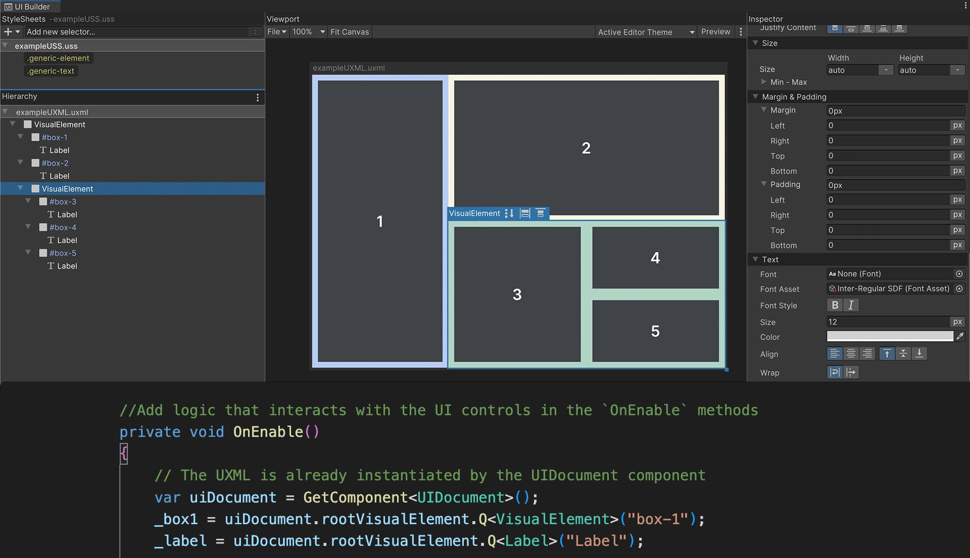
Ниже показан UXML-файл и его код в панели UXML Preview окна UI Builder. Чтобы создать ресурс в UI Builder, выберите File > New, а затем Save As.
Щёлкните значок в правом верхнем углу окна Code Preview, чтобы открыть код в своей IDE.
В этом примере кода UXML визуальные элементы представлены разметкой, напоминающей HTML, с открывающими и закрывающими угловыми скобками. Например, так выглядит синтаксис кнопки Start: <engine:Button text="START" name="start-game__button" />
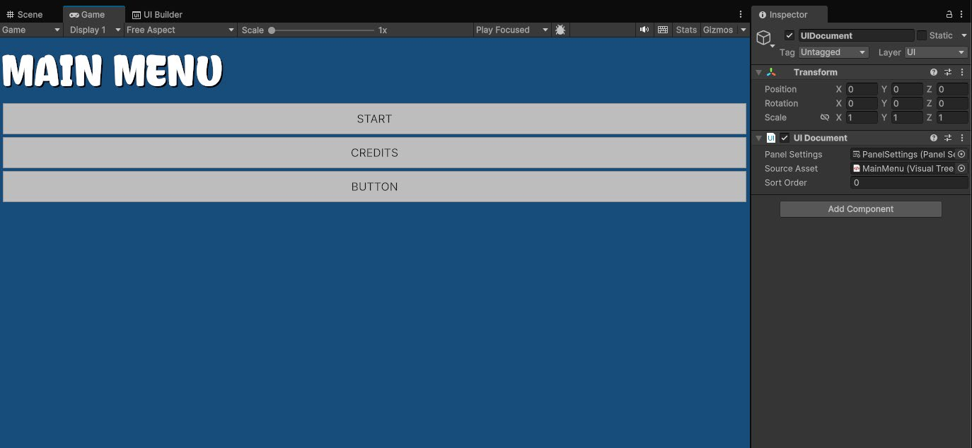
Основные компоненты времени выполнения Элементы UI Toolkit не отображаются в окне Scene. Создаваемый интерфейс виден в UI Builder, но более точный предварительный просмотр с целевым разрешением даёт окно Game. Чтобы вывести UI в окне Game, на GameObject должен находиться компонент UI Document с ресурсами Panel Settings и Visual Tree (UXML), как показано на снимке:
Компонент UI Document определяет, какой UXML будет отображаться, и по умолчанию содержит ресурс Panel Settings. Поле Sort Order задаёт порядок этого документа относительно других UI Document, использующих те же Panel Settings. Добавьте компонент на GameObject через меню Add Component в инспекторе или щёлкните правой кнопкой мыши в Hierarchy и выберите UI Toolkit > UI Document ресурс Panel Settings будет назначен автоматически. Ресурс Panel Settings определяет, как компонент UI Document создаётся и отображается во время выполнения. В проекте может быть несколько Panel Settings для разных вариантов UI. Например, HUD и мини-карта могут использовать собственные Panel Settings.
Создайте ресурс через Assets > Create > UI Toolkit > Panel Settings Asset. Он появится в корневой папке проекта, после чего его можно назначить компоненту UI Document на GameObject.
Адаптивные макеты: Flexbox UI Toolkit позиционирует визуальные элементы с помощью Yoga - механизма компоновки HTML/CSS, реализующего подмножество Flexbox. Если вы ещё не знакомы с Yoga и Flexbox, эта глава поможет освоить принципы, лежащие в основе системы компоновки UI Toolkit.
Flexbox, или Flexible Box Layout, - способ размещать элементы по строкам или столбцам. Эта система отлично подходит для сложных, хорошо организованных макетов. Рассмотрим несколько её преимуществ:
- Адаптивный UI. Flexbox организует содержимое в сеть блоков или контейнеров. Элементы можно вкладывать друг в друга как родительские и дочерние и размещать на экране по простым правилам. Дочерние элементы автоматически реагируют на изменения родительских контейнеров. Адаптивный макет подстраивается под разные размеры и разрешения экрана, упрощая поддержку нескольких платформ. - Упорядоченная сложность. Стили задают простые правила, управляющие внешним видом визуального элемента. Один стиль можно одновременно применить к сотням элементов, а изменения сразу отразятся во всём UI. Благодаря этому дизайн интерфейса строится на единообразных повторно используемых стилях, а не на ручном оформлении каждого элемента. - Разделение логики и дизайна. Макеты и стили UI отделены от кода. Дизайнеры и разработчики могут работать параллельно, не нарушая зависимости, и каждый сосредотачивается на своей специализации.
Разделение логики и дизайна. Программисты связывают визуальные элементы с игровой логикой, а дизайнеры сосредотачиваются на определении их стилей.
Визуальные элементы В UI Toolkit основными строительными блоками каждого интерфейса служат визуальные элементы. VisualElement - базовый класс всех элементов UI Toolkit: кнопок, изображений, текста и других компонентов. Их можно считать аналогом GameObject в UI Toolkit. Иерархия UI из одного или нескольких визуальных элементов называется визуальным деревом (Visual Tree). .
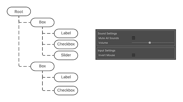
Упрощённая иерархия визуального дерева и соответствующий ей интерфейс справа
Комбинации визуальных элементов хранятся в UXML-файлах. Они содержат сведения об иерархии, макете элементов и их стилях, если те не вынесены в StyleSheet или USS.
Прежде чем углубляться в UI Toolkit, необходимо освоить основы компоновки Flexbox. Их удобно изучать на простых визуальных элементах в UI Builder.
Позиционирование визуальных элементов При создании макета UI рассматривайте каждый экран как отдельную группу визуальных элементов. Продумайте, на какие блоки его разбить, как расположить эти блоки по горизонтали или вертикали и нужны ли вложенные блоки для дальнейшей организации информации.
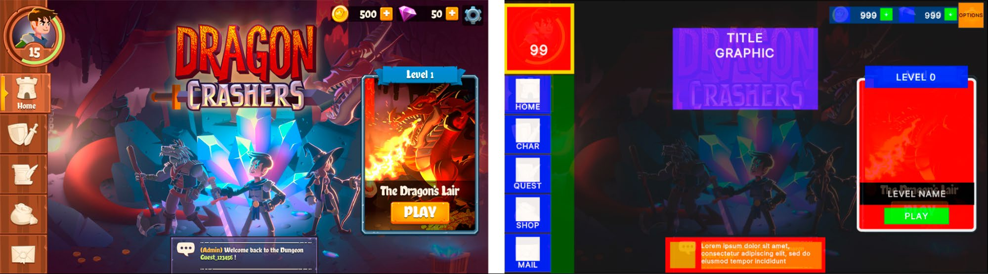
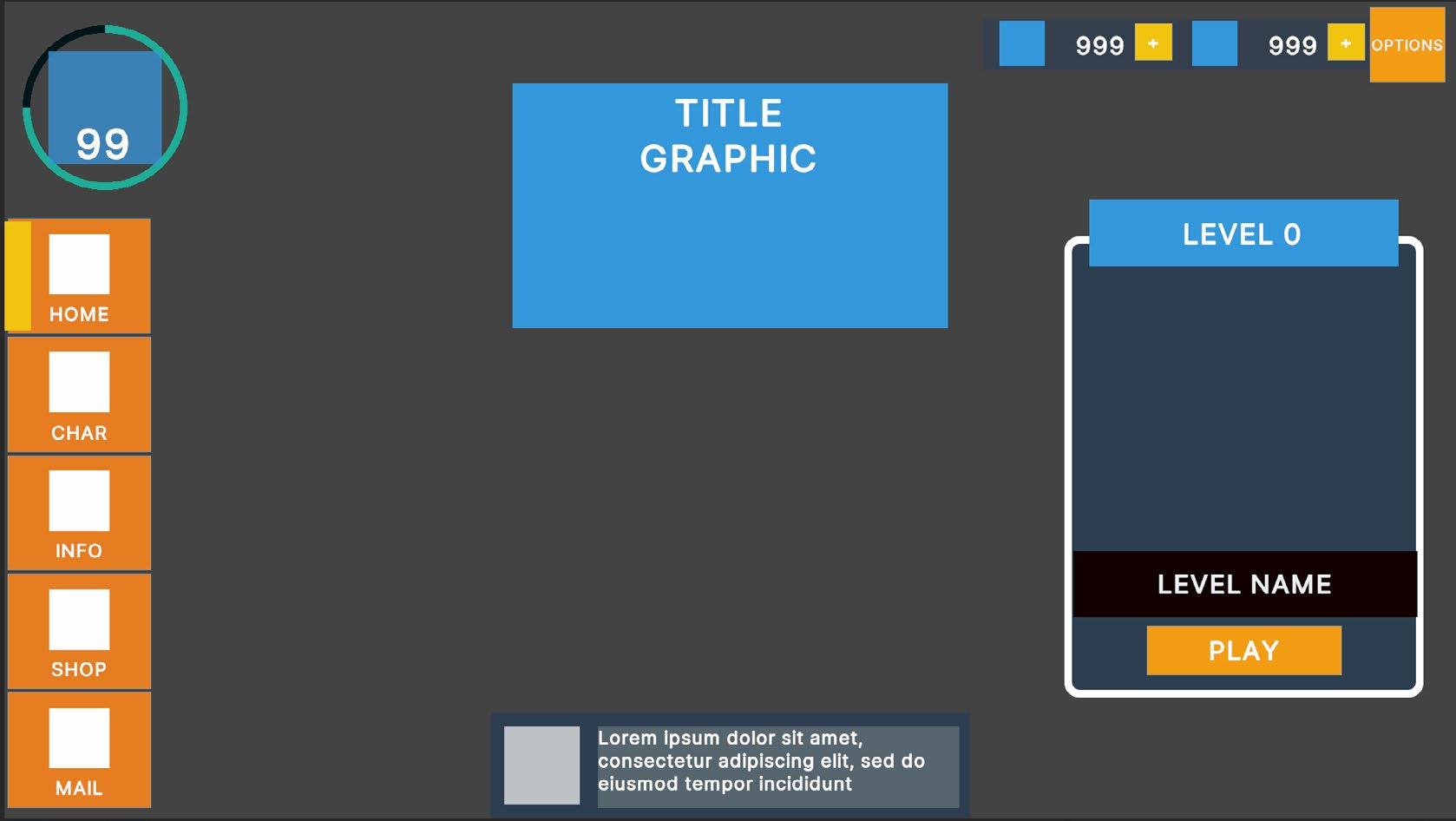
В примере ниже один большой визуальный элемент может служить контейнером для панели меню и её содержимого слева. Каждую кнопку следует представить отдельным дочерним визуальным элементом.
Рекомендуется подготовить подробный макет или каркас (слева), а затем выделить и разметить элементы, из которых этот дизайн будет собран в UI Toolkit (справа).
UI Builder поддерживает два способа позиционирования визуальных элементов:
- Относительное позиционирование. Используется по умолчанию для новых визуальных элементов. Дочерние элементы подчиняются правилам Flexbox родительского контейнера. Например, если Direction родителя задан как Row, дочерние визуальные элементы располагаются слева направо. При относительном позиционировании размеры и положение элементов динамически зависят от следующих факторов:
- Размер и правила стиля родительского элемента. Если изменить параметры родителя, например Padding или Align > Justify Content, дочерние элементы соответствующим образом перестроятся. - Собственные размеры и правила стиля дочернего элемента. Если для дочернего визуального элемента заданы минимальные или максимальные размеры, система компоновки также старается их соблюдать. UI Toolkit разрешает возникающие противоречия между параметрами родительского и дочернего элементов. Например, если минимальная ширина дочернего элемента больше ширины контейнера, содержимое выйдет за его границы.
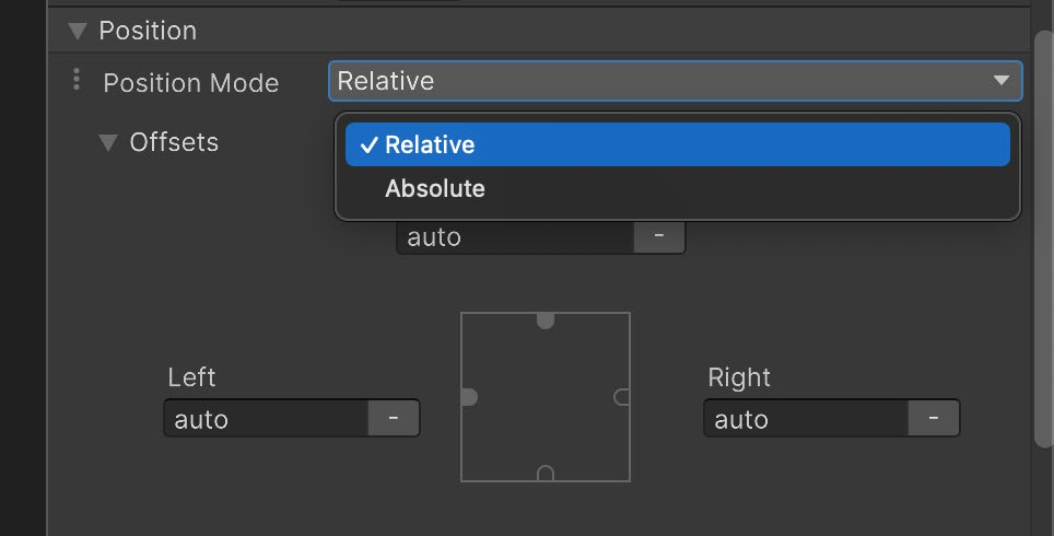
Режимы позиционирования, доступные для любого визуального элемента
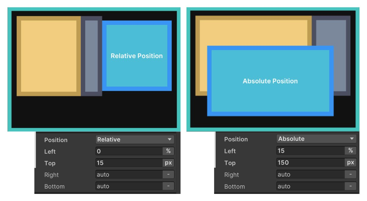
- Абсолютное позиционирование. Положение визуального элемента привязывается к родительскому контейнеру, как при работе Unity UI с Canvas. Правила размера и параметры, влияющие на дочерние элементы, продолжают действовать, но сам элемент накладывается поверх родительского контейнера и игнорирует такие параметры Flex, как Grow, Shrink и Margins. Для привязки абсолютно позиционированного элемента можно использовать Left, Top, Right и Bottom. Например, нулевые значения Right и Bottom закрепят Button в правом нижнем углу родительского контейнера.
Слева синий визуальный элемент использует Relative, а у его родителя для Flex задано Direction: Row. Справа синий визуальный элемент использует Absolute и игнорирует правила Flexbox родителя.
Относительное позиционирование обычно подходит для постоянно видимых элементов, сложных групп и контейнеров с множеством дочерних элементов. Абсолютное удобно для временных интерфейсов, например всплывающих окон, декоративных элементов, не влияющих на общую компоновку, и UI, следующего за игровыми объектами, например индикатора здоровья персонажа.
Параметры размера Помните, что визуальные элементы представляют собой контейнеры. В Unity 6 значение Grow по умолчанию равно 1, поэтому элемент занимает всё свободное место в контейнере. В иных случаях он не занимает пространства, если только внутри нет дочерних элементов с заданным размером или самому элементу не назначены определённые Width и Height.
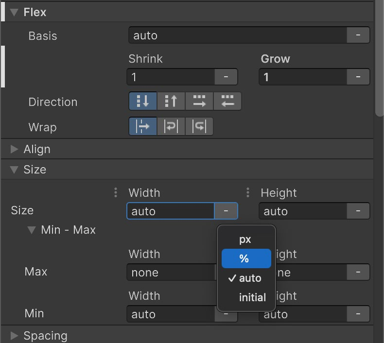
Параметры размера визуального элемента
Поля Width и Height определяют размер элемента. Max Width и Max Height ограничивают его расширение, а Min Width и Min Height - сжатие. Вместо значения auto по умолчанию размеры можно задать в пикселях или процентах. Эти параметры влияют на то, как настройки Flex, описанные ниже, изменяют размер элементов в зависимости от свободного пространства.
Параметры Flex При относительном позиционировании параметры Flex могут изменять размер элемента. Рекомендуется поэкспериментировать с ними, чтобы на практике понять их действие. Basis задаёт исходные Width и Height до применения коэффициентов Grow и Shrink:
- Если Grow равен 1, элемент займёт всё доступное вертикальное или горизонтальное пространство родителя. При значении 0,5 он займёт половину свободного пространства. - Если Grow равен 0, элемент не увеличивается сверх текущего Basis, то есть исходного размера.
- Если Shrink равен 1, элемент сжимается настолько, насколько требуется, чтобы поместиться в свободном пространстве родителя. - Если Shrink равен 0, элемент не сжимается и при необходимости выходит за границы контейнера.
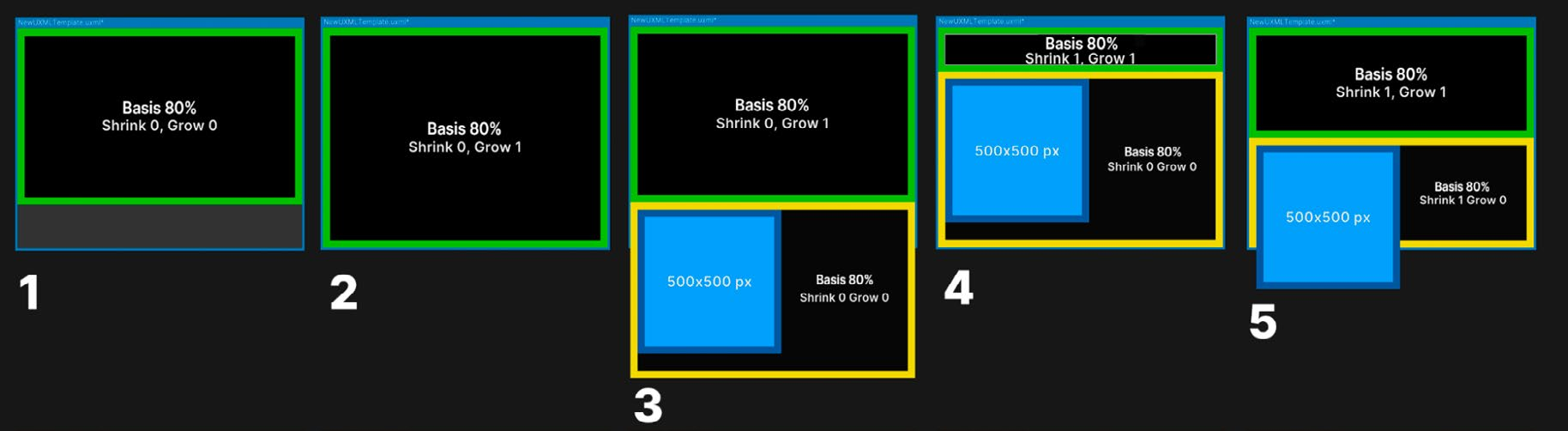
Параметры Basis, Grow и Shrink
Пример выше показывает совместную работу Basis, Grow и Shrink: 1. Зелёный элемент с Basis 80% занимает 80% доступного пространства. 2. При Grow 1 зелёный элемент расширяется на всё свободное пространство. 3. После добавления жёлтого элемента содержимое выходит за границы контейнера, а зелёный элемент вновь занимает 80% пространства. 4. При Shrink 1 зелёный элемент сжимается, освобождая место для жёлтого. 5. Здесь Shrink обоих элементов равен 1, поэтому они сжимаются в равной степени и вместе помещаются в доступном пространстве. Как видно из примера, элементы с фиксированным размером в пикселях - синий блок на шагах 3-5 - не реагируют на параметры Basis, Grow и Shrink.
Совет: расчёт размера визуального элемента При относительном позиционировании система компоновки объединяет параметры Size и Flexbox, чтобы определить итоговый размер каждого элемента. Расчёт выполняется следующим образом:
1. Система компоновки рассчитывает размер элемента по свойствам Width и Height. 2. Затем она проверяет, осталось ли в родительском контейнере свободное место или дочерние элементы уже выходят за доступные границы. 3. Если свободное место есть, система находит элементы с ненулевым Flex > Grow и распределяет между ними дополнительное пространство пропорционально этому коэффициенту, увеличивая дочерние элементы. 4. Если дочерние элементы не помещаются, элементы с ненулевым Flex > Shrink соответствующим образом уменьшаются. 5. Затем учитываются прочие свойства, влияющие на итоговый размер элемента, например Min Width и Flex Basis. 6. Система компоновки применяет рассчитанный итоговый размер.
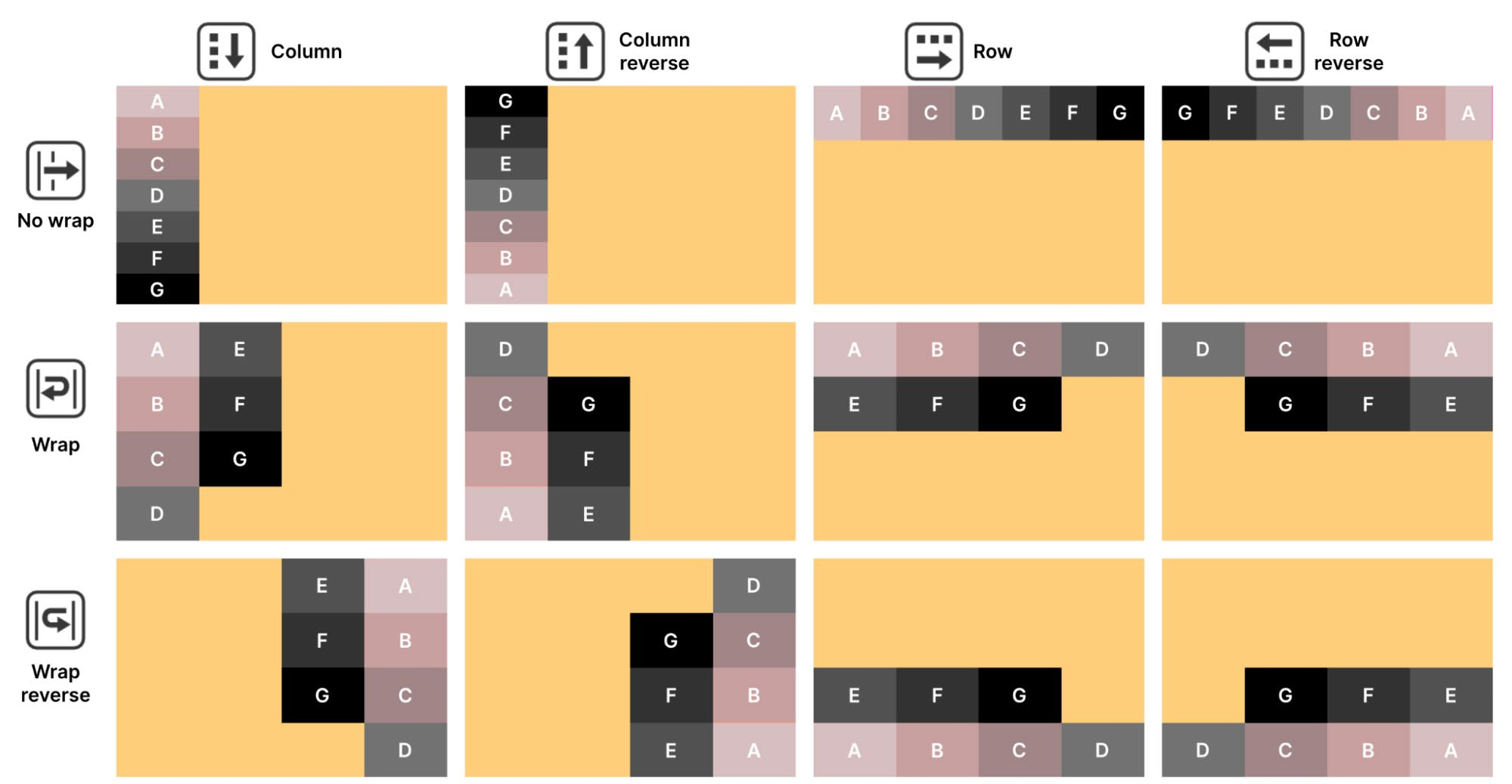
Параметр Direction определяет порядок дочерних элементов внутри родителя. Элементы, расположенные выше в Hierarchy, выводятся первыми, а находящиеся в конце - последними. Параметр Wrap указывает, следует ли пытаться уместить элементы в одной строке или одном столбце (No Wrap) либо переносить их в следующую строку или столбец (Wrap или Wrap Reverse).
Родительские и дочерние визуальные элементы в UI Builder с относительным позиционированием и разными сочетаниями Direction и Wrap
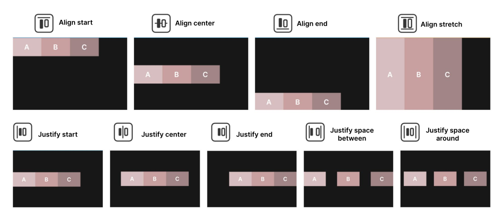
Параметры выравнивания Параметры Align определяют выравнивание дочерних элементов относительно родителя. В родительском элементе задайте Align > Align Items, чтобы прижать дочерние элементы к началу, центру или концу. Эти варианты действуют вдоль поперечной оси, перпендикулярной строке или столбцу из Flex > Direction. Stretch также работает по поперечной оси, но его эффект могут ограничивать минимальные и максимальные размеры; этот вариант используется по умолчанию.
Значение Auto позволяет системе компоновки автоматически выбрать один из остальных вариантов с учётом других параметров. Для более точного управления макетом рекомендуется явно выбирать нужный режим, оставляя Auto для особых случаев.
Параметр Align > Justify Content определяет распределение дочерних элементов внутри родителя. Они могут располагаться вплотную друг к другу либо распределяться по доступному пространству. На результат также влияют Flex > Grow и Flex > Shrink.
Параметры Align и Justify применены к родительскому элементу с Direction: Row. Обратите внимание: на итоговый результат могут влиять и другие параметры положения и размера.
Параметр Align Self позволяет самому контейнеру выровняться по центру, началу или концу Flex-макета.
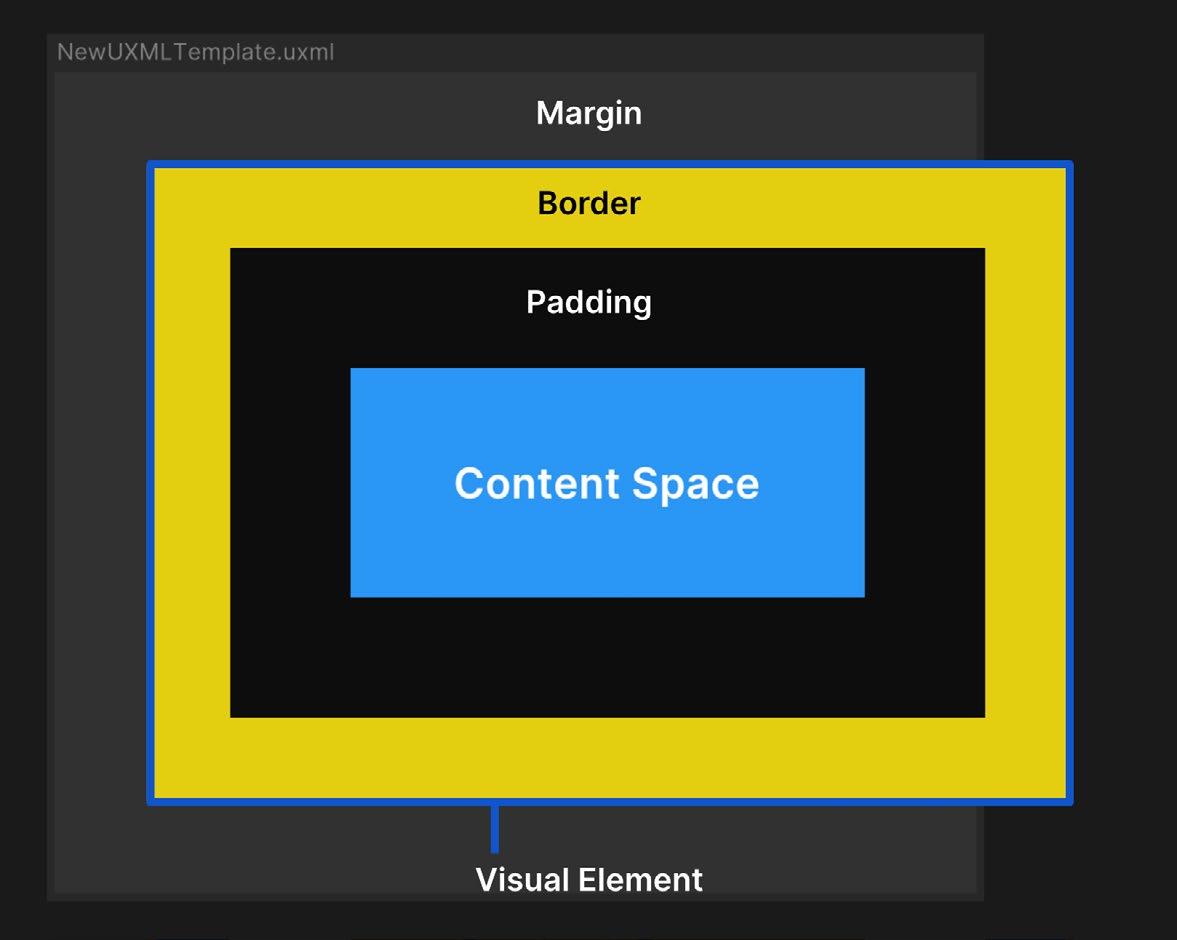
Внешние и внутренние отступы Параметры Margin и Padding задают свободное пространство вокруг визуальных элементов и их содержимого. Unity использует разновидность стандартной блочной модели CSS, представленную на схеме ниже.
Визуальный элемент в UI Builder с заданными Size, Margin, Border и Padding. Элементы с фиксированными Width или Height могут выходить за границы доступного пространства.
- Content Space содержит основные визуальные компоненты: текст, изображения, элементы управления и т. д.
- Padding задаёт пустую область вокруг Content Space, но внутри Border. - Border образует границу между Padding и Margin. Ей можно назначить цвет и скругление. При заданной толщине Border расширяется внутрь. - Margin, как и Padding, задаёт свободную область, но уже снаружи Border. Для элементов с Position: Absolute параметры Margin не действуют; внешнее пространство относительно точки привязки можно добавить параметрами Position.
Фон и изображения В UI Toolkit любой визуальный элемент может выводить изображение на экран. Достаточно задать свойство background и назначить текстуру или спрайт. Цвет или изображение фона меняет внешний вид элемента и особенно удобно при создании каркаса. Яркие контрастные цвета помогают увидеть, как соседние элементы сочетаются и реагируют на изменения контейнеров.
На этапе создания каркаса используйте контрастные цвета.
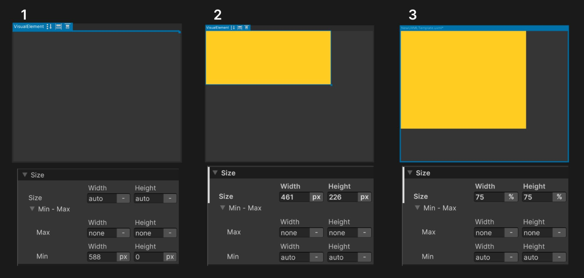
Относительные и фиксированные единицы измерения В UI Builder расстояния и размеры элементов задаются четырьмя вариантами: - Auto. Значение по умолчанию для размера и положения. Система компоновки рассчитывает параметры элемента по сведениям о родителе и дочерних элементах. - Percentage. Единица равна процентной доле контейнера и динамически меняется вместе с Width и Height родителя. Проценты помогают масштабировать макет для экранов разных форматов. - Pixels. Подходит для фиксированного размера. Например, небольшим элементам можно задать минимальный размер в пикселях, чтобы они всегда оставались читаемыми. - Initial. Возвращает свойство в исходное состояние, заданное стандартными правилами стилей Unity, и игнорирует текущие значения оформления.
Примеры стандартных параметров Size и размеров, заданных в пикселях и процентах
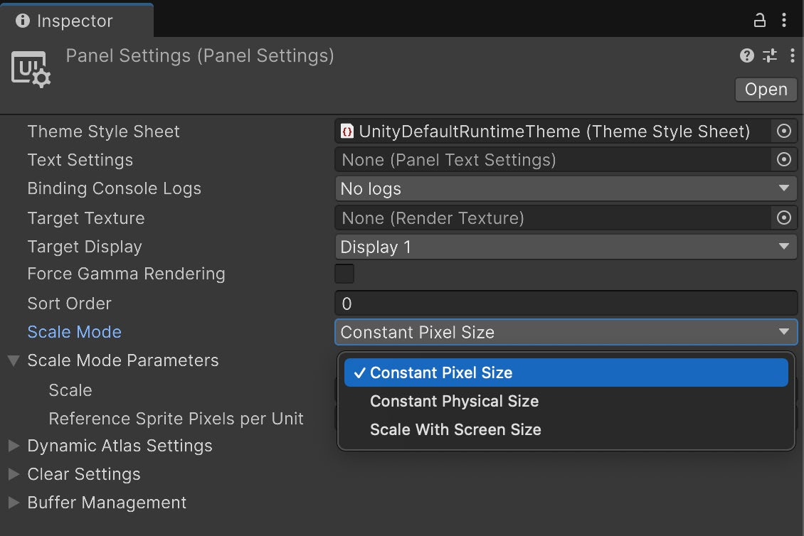
Чтобы применить единое правило масштабирования ко всему UI, используйте параметры Scale Mode в Panel Settings: - Constant Pixel Size. Элементы сохраняют фиксированный размер в пикселях независимо от размеров экрана. Для пропорционального изменения всех размеров можно задать Scale Factor.
- Constant Physical Size. Элементы сохраняют одинаковый физический размер на разных экранах. Система масштабирует UI относительно Reference DPI, корректируя размер при отличии фактического DPI экрана.
- Scale with Screen Size. Размеры элементов динамически меняются в зависимости от разрешения. Screen Match Mode определяет приоритет ширины, высоты или их сочетания, а Reference Resolution задаёт базовый размер UI. Если в Screen Match Mode выбран Match Width or Height, значение Match определяет, будет ли UI подстраиваться под ширину экрана, его высоту или промежуточное соотношение.
В Panel Settings системы UI Toolkit доступны параметры масштабирования, похожие на параметры Unity UI.
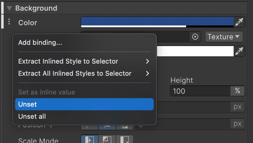
Переопределённые свойства в UI Builder Изменённые свойства выделяются в инспекторе жирным шрифтом и белой линией, как на снимке ниже. Это означает, что они переопределяют стандартные значения или значения селектора из таблицы стилей USS выбранного UXML-файла. Такое оформление также называют встроенным стилем (inline styling). Если значение менять не требуется, лучше оставить его в исходном состоянии: так переопределения легче находить и контролировать. Чтобы сбросить свойство, воспользуйтесь соответствующей командой в меню с вертикальным многоточием ( ) рядом с разделом свойств.
В этом меню изменённое значение можно вернуть к стандартному или к исходному значению селектора.
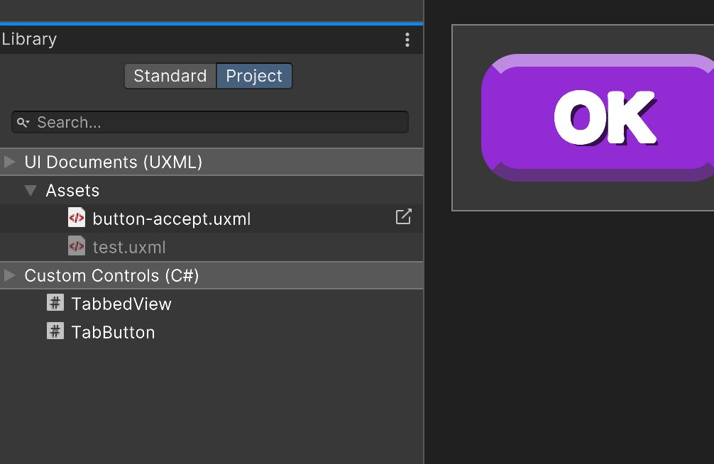
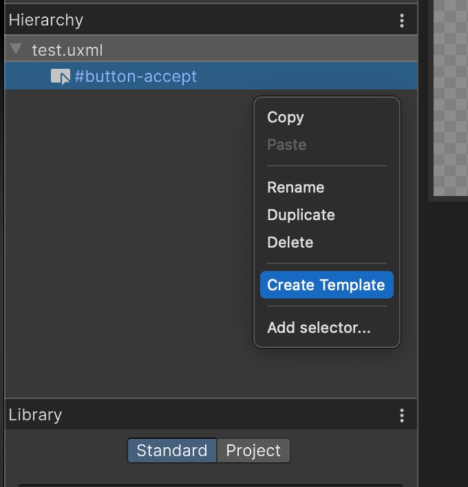
UXML как шаблоны UXML-файлы можно использовать подобно префабам. Например, в проекте может быть UXML-макет со значком предмета и счётчиком количества, который нужно многократно создавать в инвентаре. Щёлкнув правой кнопкой мыши любой UXML, можно создать Template. Затем его можно добавить к другому визуальному элементу в области Hierarchy или создать экземпляр из кода. Готовый шаблон появится в Library и окне Project.
Шаблоны представляют повторно используемые UXML и доступны на вкладке Project области Library.
Дополнительные ресурсы Подробнее о системе компоновки Flexbox можно узнать из следующих материалов. Flexbox и Yoga - признанные стандарты веб-разработки и разработки приложений, поэтому в интернете доступно множество дополнительных источников.
- UI Toolkit во время выполнения: подробный разбор
- Официальная документация Yoga - Руководство CSS-Tricks по Flexbox
Layouts
The UI Builder gives you all the tools you need to design a responsive layout.
This section covers the essential steps to creating layouts in UI Builder. UI Builder is a WYSIWYG, designer-friendly tool to help create UXML and USS files efficiently and without writing code. While some teams may prefer creating UI directly in code, UI Builder empowers artists with creative control, enabling significant workflow improvements. When you make changes in the UI Builder, it generates the code for you, and everything you create in UI Builder can be implemented as code directly in UXML and USS. The efficient set up of responsive layouts is a major benefit of using UI Toolkit and UI Builder. Such layouts are a necessary feature for any game that is targeting multiple platforms with different screen resolutions and ratios. This section covers the essential steps to creating layouts in UI Builder. Below is a UXML file with its code displayed in the UXML Preview panel in UI Builder. In UI Builder, create the asset via File > New and then Save As.
By clicking the icon in the upper right corner of the Code Preview window you it will open it in your IDE.
In this example UXML code, you can see visual elements are represented as markup language that resembles HTML, such as starting with an open and ending bracket. For example, this is the syntax for a start button: <engine:Button text="START" name="start-game__button" />
Core runtime components UI Toolkit elements won’t appear in the Scene view. You can see the interface as you make it in UI Builder, but the Game view provides a more accurate preview at the target resolution. To render the UI in Game view, a GameObject must have a UI Document component with a Panel Settings asset and a Visual Tree asset (UXML), as seen in this screenshot:
A UI Document Component defines what UXML will be displayed, and comes with a default Panel Settings asset. The Sort Order field determines how this document shows up in relation to other UI Documents using the same Panel Settings. Add this component to a GameObject using the Add Component menu in the Inspector, or right-click in the Hierarchy and select UI Toolkit > UI Document, which will automatically assign the Panel Settings asset. The Panel Settings asset defines how the UI Document component will be instantiated and visualized at runtime. It’s possible to have multiple Panel Settings assets to enable different styles for the UIs. If your game includes HUD or a minimap, for instance, these special UIs could each have their own Panel Settings. Create the asset via Assets > Create > UI Toolkit > Panel Settings Asset. It will be added to your root project folder, which can then be applied to a UI Document component on a GameObject.
Responsive layouts: Flexbox UI Toolkit positions visual elements based on Yoga, an HTML/CSS layout engine that implements a subset of Flexbox. If you’re unfamiliar with Yoga and Flexbox, this chapter will get you up to speed on the principles behind UI Toolkit’s layout engine.
Flexbox (or Flexible Box Layout) is a method for arranging items in rows or columns. Flexbox architecture is great for developing complex, well-organized layouts. Consider a few of its advantages: —
Responsive UI: Flexbox organizes everything into a network of boxes or containers. You can nest these elements as parents and children and arrange them spatially onscreen using simple rules. Children respond automatically to changes in their parent containers. A responsive layout adapts to different screen resolutions and sizes, allowing you to target multiple platforms more easily.
Organized complexity: Styles define simple rules that control the aesthetic values of a visual element. One style can be applied to hundreds of elements at once, with changes immediately reflected on the entire UI. This centers UI design around consistent reusable styles rather than working on the appearance of individual elements.
Decoupled logic and design: UI layouts and styles are decoupled from the code. This helps designers and developers work in parallel without breaking dependencies. Each user can then focus on what they do best.
Decoupling logic and design: Programmers can connect the visual elements to the actual game logic while designers focus on defining the styles for them.
Visual elements In UI Toolkit, the fundamental building blocks of each interface are their visual elements. A visual element is the base class of every UI Toolkit element (buttons, images, text, etc.) Think of them as UI Toolkit equivalents of GameObjects. A UI Hierarchy of one or more visual elements is called a Visual Tree.
A simplified UI Hierarchy of a visual tree and how it looks on the right side
Combinations of multiple visual elements are stored in UXML files, which contains information related to the hierarchy, as well as its styling (if not using a StyleSheet or USS) and the layout of visual elements. Before we dive deeper into UI Toolkit, you’ll need to understand the fundamentals of Flexbox Layout, which can be demonstrated with basic visual elements in the UI Builder.
Positioning visual elements When mocking up a UI, approach each screen as a separate group of visual elements. Think about how to break the screens down into boxes that stack up horizontally or vertically and if they need child boxes to keep organizing the information.
In the below example, one large visual element could be a container, the menu bar and its elements on the left. Separate child visual elements to represent each of the buttons.
A good practice is to have a detailed mockup or wireframe (left) and identify and block out the elements to recreate the design in UI Toolkit (right).
UI Builder offers two position options for visual elements: —
Relative positioning: This is the default setting for new visual elements. Child elements follow the Flexbox rules of the parent container. For example, if the parent element’s Direction is set to Row, child visual elements arrange themselves from left to right. Relative positioning resizes and moves elements dynamically based on: —
The parent element’s size or style rules: If you modify a parent element’s settings via Padding or Align > Justify Content, its children adjust themselves according to those changes.
The child element’s own size and style rules: If the child visual element has its own minimum or maximum size settings, the layout engine tries to respect those as well.
UI Toolkit handles any conflicts between the parent and child element (so a child element with a minimum width that is wider than its container, for instance, results in an overflow).
Position modes available for any visual element
Absolute positioning: Here, the position of the visual element anchors to the parent container, similar to how Unity UI works with Canvases. Size rules or rules that affect the children elements still apply, but the element itself will overlay on top of the parent container ignoring flex settings like Grow, Shrink, or Margins. Absolutely positioned elements can use the Left, Top, Right, and Bottom settings as anchors. For example, zero values for the Right and Bottom pin a Button to the bottomright of the parent container.
On the left, the blue visual element has a Relative position, with the parent element using Direction: Row as the Flex setting. On the right, the blue visual element uses Absolute position and ignores the parent element’s Flexbox rules.
You’ll probably want to use Relative positioning for elements that are permanently visible, have complex grouping, or contain a number of elements. Absolute positioning can be useful for temporary UIs (like pop-up windows), decorative elements that don’t interfere with the layout composition, or elements that follow the position of other in-game elements (like a character’s health bar).
Size settings Remember that visual elements are simply containers. In Unity 6, their default Grow setting is set to 1, which means they will take all the available space in the container. Otherwise they don’t take up any space unless they are filled with other child elements that already have a specific size, or you set them to a particular Width and Height.
Size settings for a visual element
The Width and Height fields define the size of the element. The Max Width and Max Height limit how much it can expand. Likewise, the Min Width and Min Height limit how much it can contract. You can define the sizes in pixel units or percentages overriding the default auto. These impact how the Flex settings (below) can resize the elements based on available space.
Flex settings The Flex settings can affect your element’s size when using Relative positioning. It’s recommended that you experiment with elements to understand their behavior firsthand. Basis refers to the default Width and Height of the item before any Grow or Shrink ratio operation occurs: —
If Grow is set to 1, this element will take all the available vertical or horizontal space in the parent element. If it was set to 0.5 it would take half of all the available space.
If Grow is set to 0, the element does not grow beyond its current Basis (or size).
If Shrink is set to 1, the element will shrink as much as required to fit in the parent element’s available space.
If Shrink is set to 0, the element will not shrink and will overflow if necessary.
Basis, Grow, and Shrink settings
The above example shows how Basis works with the Grow and Shrink options: 1.
The green element with a Basis of 80% occupies 80 percent of the available space.
Setting the Grow to 1 allows the green element to expand to the entire space.
With a yellow element added, the elements overflow the space. The green element returns to occupying 80 percent of the space.
A Shrink setting of 1 makes the green element shrink to fit the yellow element.
Here, both elements have a Shrink value of 1. They shrink equally to fit in the available space.
As you can see, elements that have a fixed size expressed in pixels (the blue box in 3–5) don’t react to the Basis, Grow, or Shrink settings. Tip: Calculating visual element size The layout engine combines the Size and Flexbox settings to determine how large each element appears when using Relative positioning. Calculating a visual element’s size entails the following steps: 1.
The layout system computes the element size based on the Width and Height properties.
The layout engine checks if there is additional space available in the parent container, or if its children are already overflowing the available space.
If there is additional space available, the layout system looks for elements that have non-zero values in the Flex/Grow setting. It distributes the additional space according to that factor, expanding the child elements.
If the child elements overflow the available space, elements that have non-zero Flex/ Shrink values will reduce in size accordingly.
Any other properties that affect the resulting size of an element (Min-Width, FlexBasis, etc.) are then taken into consideration.
The layout engine applies the final, resolved size.
The Direction setting defines how child elements are arranged inside the parent. Child elements higher in the Hierarchy menu appear first. Elements at the end of the Hierarchy appear last. The Wrap setting tells the layout system whether elements should try to fit into one column or row (No Wrap). Otherwise, they appear in the next row or column (Wrap or Wrap reverse).
Parent and child visual elements in UI Builder, using Relative positioning and different Direction and Wrap combinations
Align settings The Align settings determine how child elements line up to their parent element. Set the Align > Align Items in the parent to line up child elements to the start, center, or end. These options affect the cross-axis (perpendicular to the row or column in the Flex > Direction). The Stretch option also works along the cross-axis, but the Min or Max values from the size can limit the effect (this is the default). Meanwhile, the Auto option indicates that the layout engine can automatically choose one of the other options based on other parameters. It’s recommended that you select one of the options for more control over the layout, and mainly use the Auto option for special use cases. Go to Align > Justify Content to define how the layout engine spaces child elements within the parent. These elements can line up, adjacent to one another, or spread out using the available space. The Flex > Grow and Flex > Shrink settings influence the resulting layout.
Align and Justify settings applied to a parent element with a Direction set to Row; note that other position and sizing options can affect the final output
The Align Self option allows the container to align itself to the center, end, or start position of the flex layout
Margin and Padding Use the Margin and Padding settings to define empty spaces around your visual elements and their content. Unity uses a variation of the standard CSS box model, similar to the diagram below.
A visual element in UI Builder with defined Size, Margin, Border, and Padding settings; elements with a fixed Width or Height can overflow the space
The Content Space holds your key visual elements (text, images, controls, etc.)
Padding defines an empty area around the Content Space, but inside the Border.
The Border defines a boundary between the Padding and the Margin. This can be colored and rounded. If given a thickness, the Border expands inward.
Margin is similar to Padding but defines an area outside the Border. For elements with Absolute position, the margin settings won’t have any effect but you can use the Position settings to add outside space in relation to the anchor point.
Background and images In UI Toolkit, any visual element can be used to display an onscreen image. Simply set the background property to show a texture or sprite. You can fill in a color or image to change the element’s appearance. This is helpful for wireframing. Bright colors with contrast can show how different elements look next to one another and respond to changes in their containers.
Use contrasting colors during wireframing.
Variable or fixed measuring units In UI Builder, you’ll encounter four parameters that define the distance and size of elements: —
Auto: This is the default option for size and position. The layout system calculates the elements’ values based on both the parent and child elements’ information.
Percentage: The unit equals a percentage of an element’s container and changes dynamically with the parent’s Width and Height. Working with percentages can provide scalability when dealing with multiple format sizes.
Pixels: This option is useful when you want your element to have a fixed size, for example, when you want small elements to have a minimum size in pixels that will allow them to remain readable at all times.
Initial: This sets the property back to its default state (Unity’s own default styling rules), ignoring the current styling values.
Examples of the default Size settings and Sizes defined in pixels and percentages
If you want to apply a scaling rule to the entire UI at the same time, you can do so in the Panel Settings under the Scale Mode parameters: —
Constant Pixel Size: This scale mode keeps elements at a fixed pixel size, unaffected by screen size. A Scale Factor can be applied to multiply element sizes.
Constant Physical Size: This mode maintains elements at the same physical size across screens. The system scales the UI based on a Reference DPI, adjusting the size if the actual screen DPI differs.
Scale with Screen Size: This option resizes elements dynamically based on resolution. Screen Match Mode determines whether scaling prioritizes width, height, or a blend of both. The Reference Resolution sets the UI’s base size. When Screen Match Mode is set to Match Width or Height, the Match value controls whether the UI system scales the UI to match the screen width, the screen height, or a mix of the two.
In the Panel Settings of UI Toolkit, you can find similar scaling options to the ones found in Unity UI.
Overridden properties in UI Builder Modified properties will be highlighted in the Inspector with a bold font and white line next to them as shown in the screenshot below. This indicates that they are overriding default values or values in the selector in the style sheet or USS of the selected UXML file. This behavior is also referred to as "inline styling". If a value doesn’t need to be modified, it’s best to leave it in its default state to make changes easier to find and manage. To reset a property to its default value, you can use the option available in the dots (⁝) menu next to the property section.
From this menu you can restore the modified values to the default ones or the ones originally in the selector.
UXML as templates UXML files can be used similar to prefabs. For example, you could have a project with a UXML layout that contains an item icon and count number that you need to spawn many times inside an inventory. If you right click on any UXML you get the option to create a Template, which can later be added to any other visual element in the Hierarchy pane or instantiated from code. Once created you can find it in your Library and Project view.
Templates are reusable UXML and are available in the Library pane in the Project tab.
More resources Learn more about the Flexbox layout engine with the following resources. As Flexbox and Yoga are existing standards in web and app development, there will be a variety of resources available online. —
UI Toolkit at runtime: Get the breakdown
Yoga official documentation
CSS-Tricks guide to Flexbox